
Mitroff Consulting Rebrand
Cool Beans Coffee
Poppy Farm-to-Table Bistro
Sedona Spa and Salon

Recruitment T-Shirt

Mental Health Campaign
Basketball and Volleyball Tournaments
Pacific Quest and PQ Rise

Letterpress Cards
26 Days of Type
Stencil Typeface
Pantone Line Extension
Chocolove Redesign


HELLO
My name is SarahBelle and I'm a graphic designer based in Sonoma County, CA. When I'm not at my desk working on awesome design projects, you can find me taking care of my many houseplants, baking a batch of my famous chocolate chip cookies, or watching Shark Tank with my boyfriend.EDUCATION
I graduated from Pacific Union College with my Bachelor of Fine Arts degree in graphic design (2023). Some of my best and favorite projects from my time at PUC are found here on this portfolio site. (A new site update is coming soon with recent projects.)LOVES
Things I love: affogato, cats, plants, overcast weather, fashion design, comedy movies, painting, baking, and pickles (dill, of course).
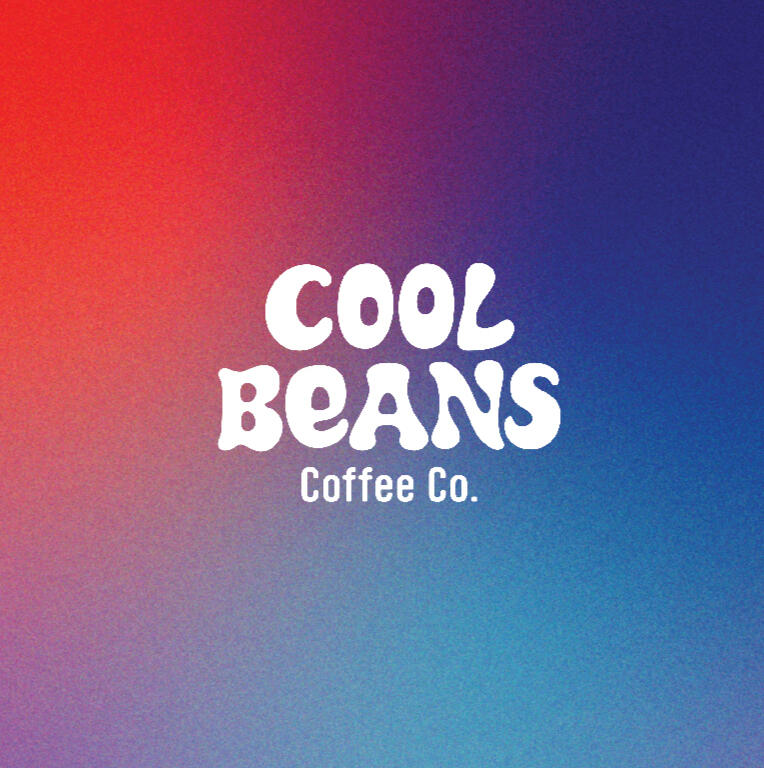
COOL BEANS - BRANDING & IDENTITYCool Beans is a fictional coffee shop geared towards college students and young adults who appreciate coffee that is sustainably sourced from the finest beans and roasted to perfection. Cool Beans believes that coffee should be both delicious and fun.The logo reflects these values, and serves as a visual representation of the commitment to providing customers with a fun and vibrant coffee shop experience—perfect for studying, socializing, or simply enjoying a delicious beverage. The use of bright, eye-catching colors conveys a sense of energy and excitement, while the playful typography adds a fun and lighthearted touch.

Untitled

Untitled

Untitled


Untitled

Untitled

Untitled


Untitled

Untitled

Untitled

Untitled
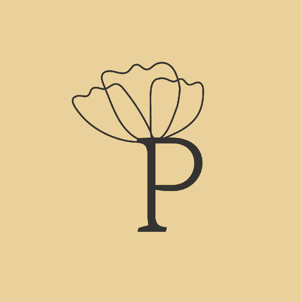
POPPY - BRANDING & IDENTITYPoppy is a farm-to-table bistro that I created a brand identity for. It consists of a main logo, submark, color palette, mockups, and a brand pattern.My goals for this fictional company were to create branding that represents the values of a farm-to-table restaurant. Poppy believes that great food should be beautiful, delicious, and sustainable.The logo reflects these values, and serves as a visual representation of Poppy’s commitment to providing customers with a dining experience that is both satisfying and environmentally responsible. Its use of warm, earthy colors and simple, organic shapes evokes the natural beauty and simplicity of farm-to-table cuisine and conveys a sense of comfort and authenticity.

Untitled

Untitled

Untitled
Untitled

Untitled

Untitled


Untitled

Untitled

Untitled

Untitled
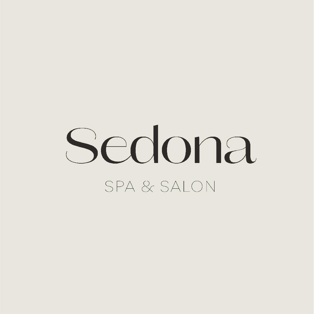
SEDONA - BRANDING & IDENTITYSedona is a luxury spa and salon that I created a brand identity for. It consists of a main logo, submark, color palette, mood images, and product mockups.My objective for this fictional spa and salon was to create branding that reflected the importance of beauty and wellness at Sedona. The branding acts as a visual representation of the commitment to providing clients with the highest quality spa services in an environment that promotes healing, relaxation, and self-care.The Sedona logo reflects these values through its use of soothing colors and simple, elegant typography. The soft, flowing lines of the logo evoke a sense of calm and relaxation, while the use of warm, earthy colors conveys a sense of comfort and natural beauty.

Untitled
Untitled

Untitled

Untitled

Untitled

Untitled


Untitled

Untitled

Untitled

Untitled
PACIFIC UNION COLLEGE T-SHIRTEach year, a new shirt is made for recruiting new students and is given to students, faculty, and staff each fall.For this year’s design, I wanted to incorporate a topographic map of Angwin, CA where the campus is located. I found a map online, then printed it, traced with sharpie, and vectorized the map in Illustrator. I also incorporated the coordinates of our campus and a redwood tree on the front of the shirt in recognition and appreciation of the scenery around PUC.

Untitled

Untitled

Untitled

Untitled

Untitled

Untitled


MENTAL HEALTH CAMPAIGNI designed the mental health posters and business cards for the Wellness Center at Pacific Union College.My goals for this project were to create a soothing and friendly poster that gives students a clear understanding of their mental health resources on campus.The previous poster was quite chaotic, and used phrases like “pain,” “anxiety,” “depression,” and “panic attacks.” This phrasing, along with the harsh black and red text on a stark white page induced negative feelings and achieved the opposite effect that PUC wants students to have regarding their well-being.To combat this, I chose soothing shades of blue, and a softer shade of red for the heart. I chose the imagery of “helping hands”—which reach out of the darkness into the light—to convey that PUC has the resources to help students who may be in need of counseling or support.

Untitled

Untitled

Untitled


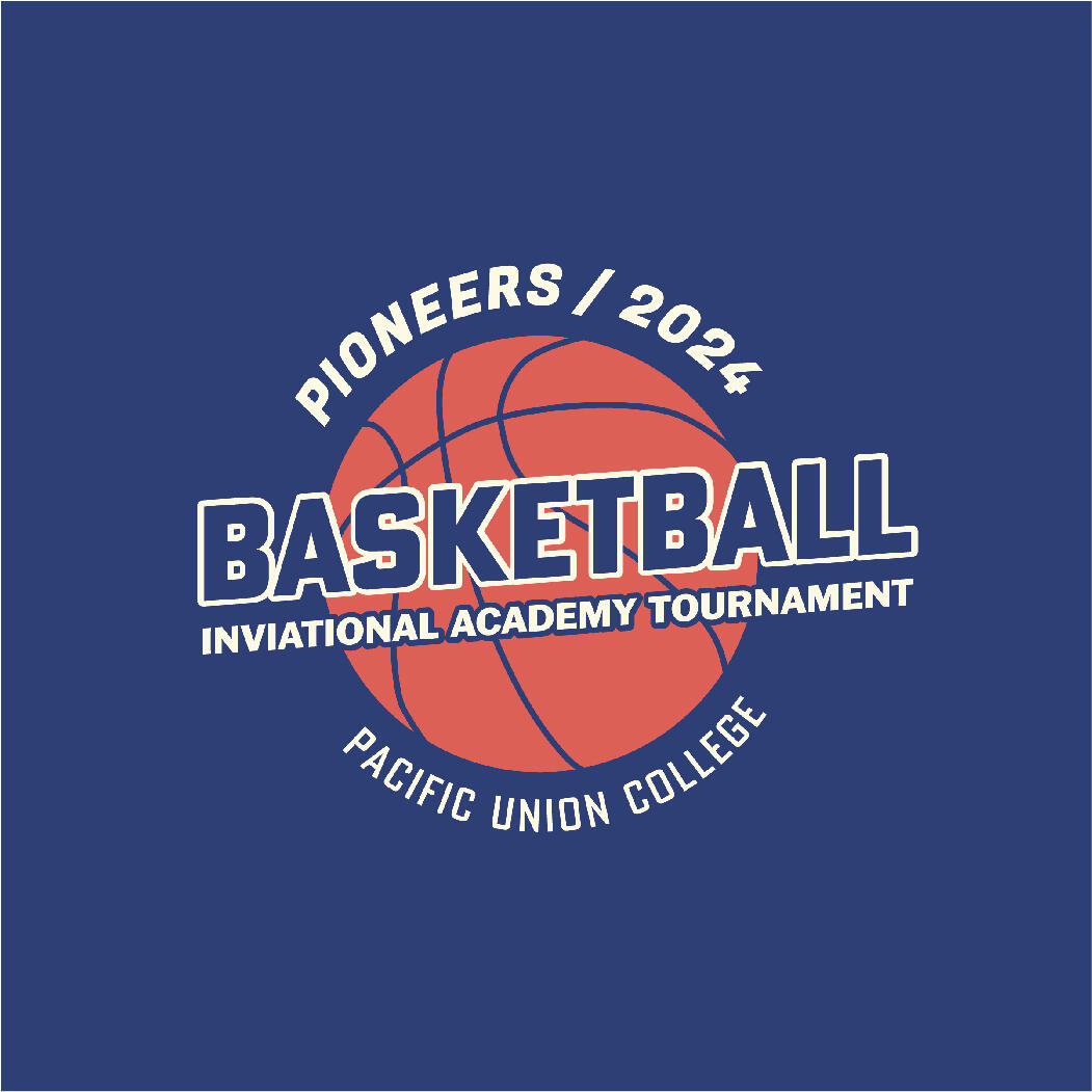
BASKETBALL & VOLLEYBALL TOURNAMENT T-SHIRTSEach year, Pacific Union College hosts the Pioneers Invitational Academy Basketball and Volleyball Tournaments for high schoolers. PUC created this opportunity for high school students to broaden their skills and interests in a Christian atmosphere, allowing students to make connections and experience PUC’s college environment.I created this artwork for use on t-shirts and social media, keeping in mind the high school audience and the active sports setting in which the art will be used.

Untitled

Untitled

Untitled
Untitled


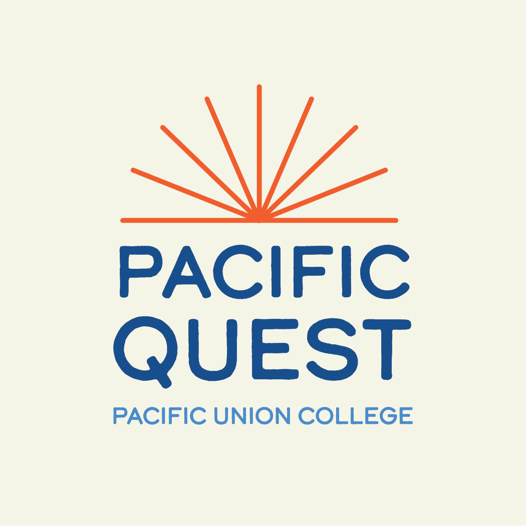
PACIFIC QUEST & PQ RISEThrough my internship with the PR & Marketing Department at Pacific Union College, I was responsible for re-designing the Pacific Quest and PQ Rise logos for Pacific Union College. Logos are used on the Pacific Quest webpage, social media, and annual t-shirts.Pacific Quest and PQ Rise are week-long summer programs at PUC for students who are inquisitive, motivated, and enjoy STEM subjects. Students participate in daily academic programming, recreational opportunities, team-building exercises, and evening activities.The theme for Summer 2023 is “4th of July,” where students learn about the principles of energy and its release, the history of explosions, the art of the American Revolution, and the music and sound effects associated with explosions. I took inspiration from these themes to design the new logos.

Untitled

Untitled

Untitled

Untitled


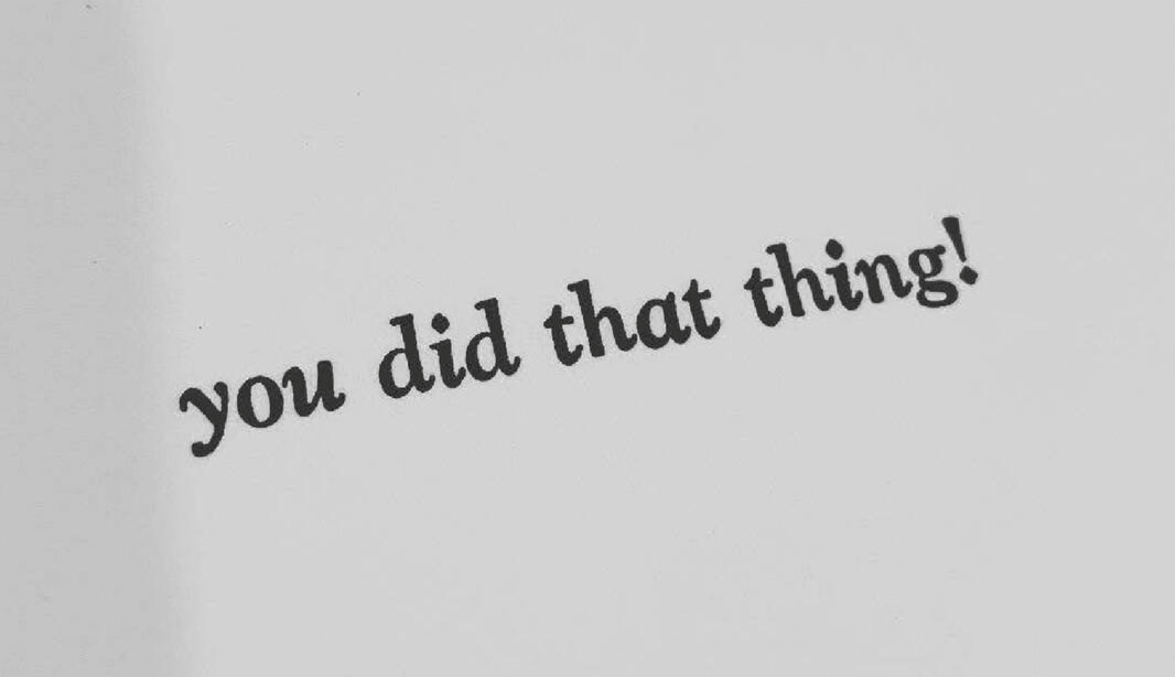
LETTERPRESS CARDSTo create the fun and funky lettering for the “Congratulations” on the front of the card, I used Adobe Illustrator. I started sketching the block letters that lined up with the wave shape. I then vectorized my sketch using basic rectanlge shapes that I edited with the pen tool. Each letter started out as a rectangle, and took their form using other shapes and the shape builder tool to subtract the negative (white) space. From this digital design, a photopolymer plate was created to be used on the letterpress with flourescent red-orange ink.The inside of the card reads, “you did that thing!” It was created using traditional letterpress methods—hand-setting lead type pieces in a composing stick which was set in a form with furniture (wood blocks) to be printed on the letterpress.

Untitled
Untitled

Untitled


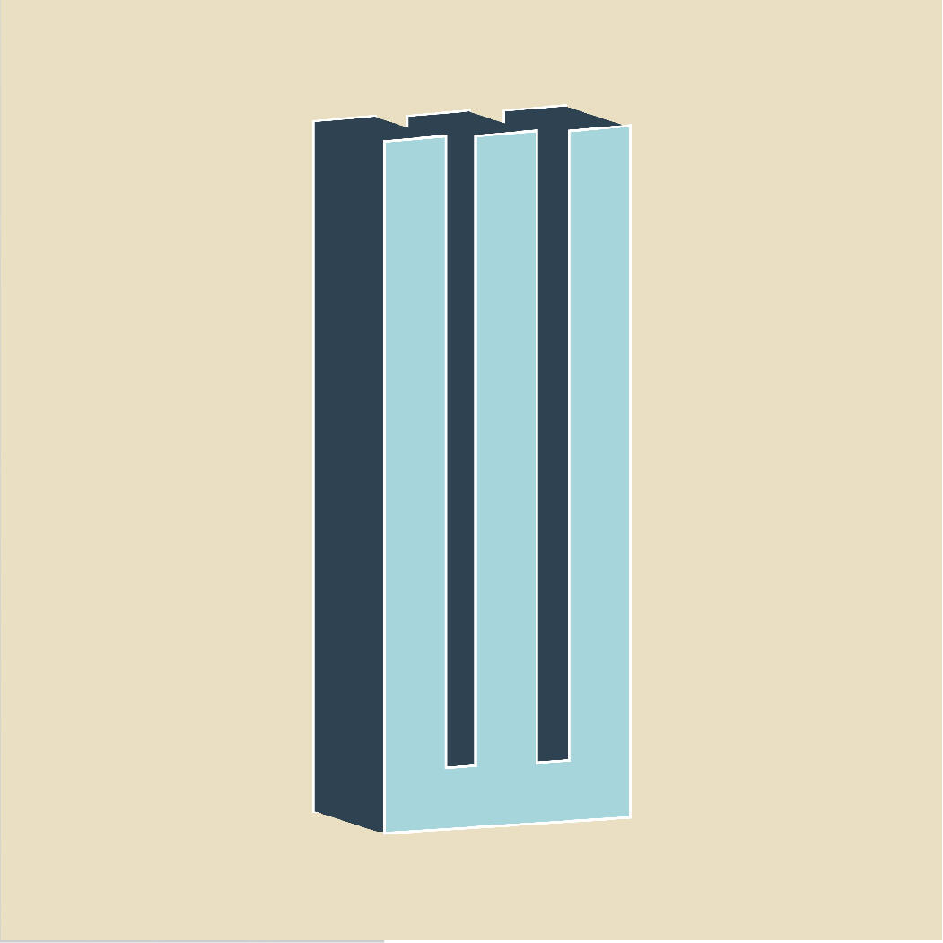
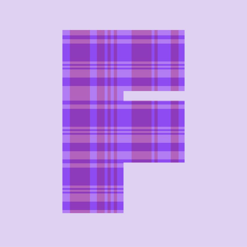
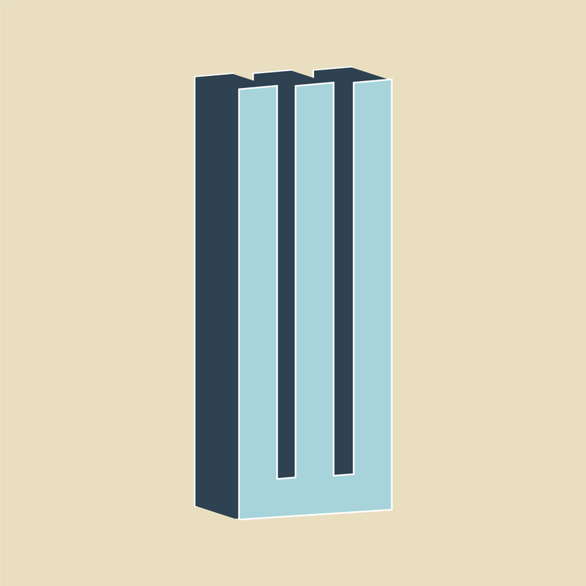
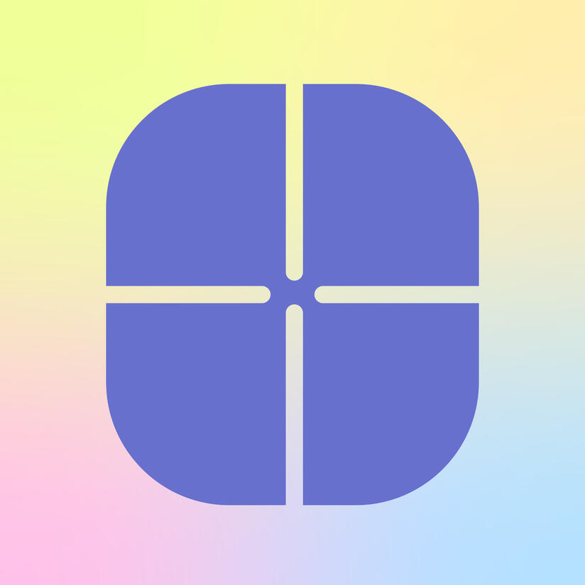
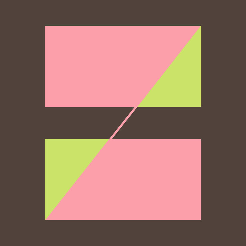
26 DAYS OF TYPEThe 26 days of type challenge is an annual creative challenge that invites artists, designers, and creatives from around the world to experiment with typography and lettering. During the challenge, people are to create one letter per day to complete the entire alphabet.I was challenged to create unique and original designs using a variety of styles and techniques. All of my letters were created using Adobe Illustrator. The challenge was a great opportunity for me to think creatively and experiment with new techniques in Illustrator.
Untitled

Untitled
Untitled
Untitled
Untitled
Untitled
Untitled

Untitled

Untitled
Untitled

Untitled
Untitled

Untitled

Untitled

Untitled

Untitled

Untitled

Untitled

Untitled

Untitled

Untitled

Untitled
Untitled
Untitled

Untitled
Untitled


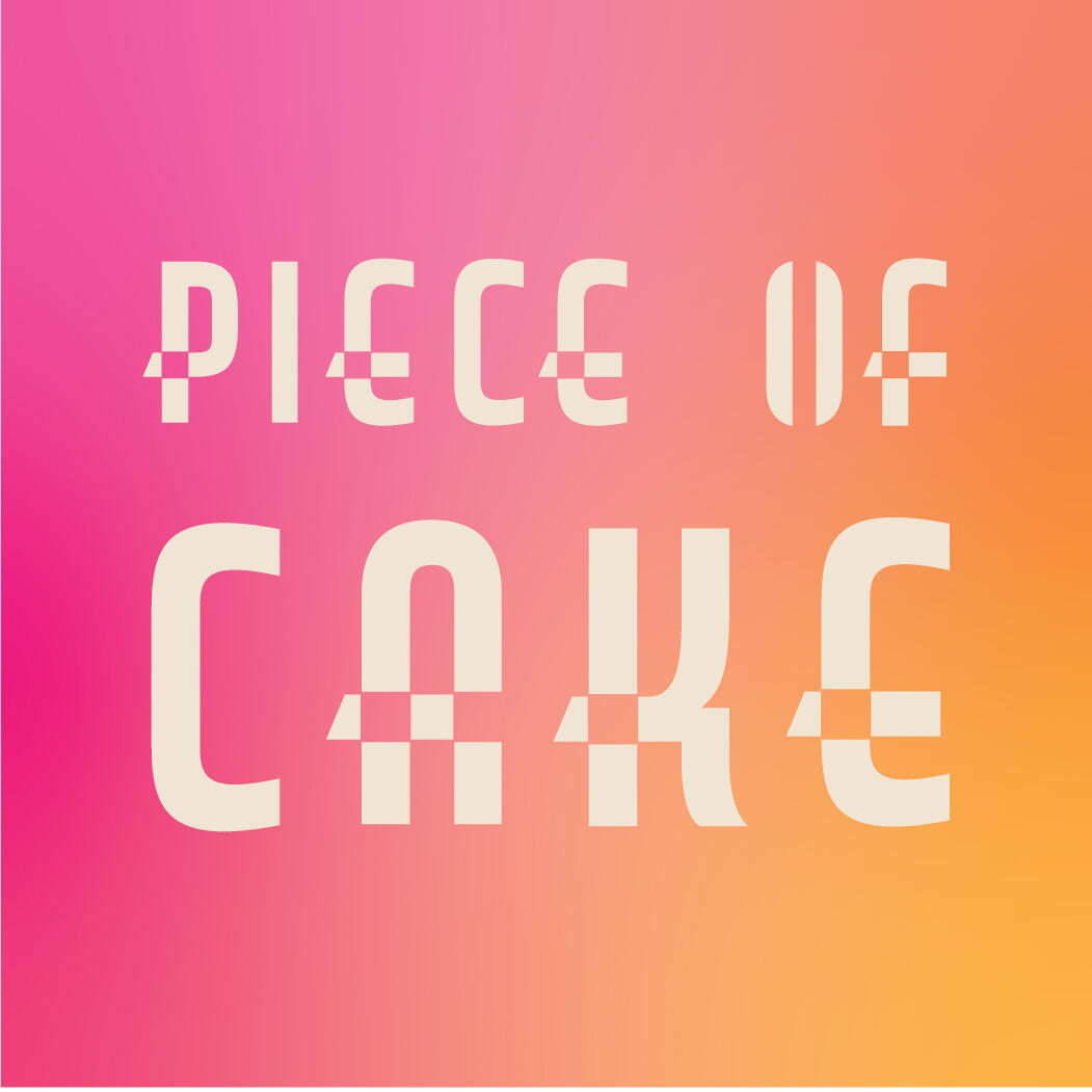
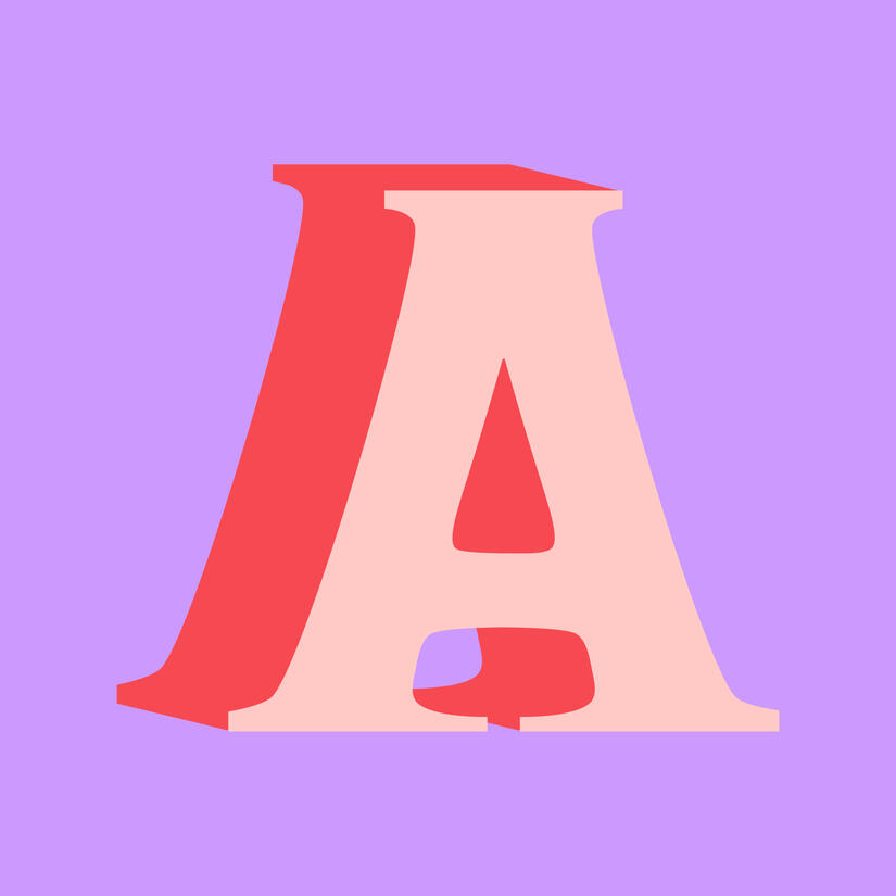
STENCIL TYPEFACEThis is a fun stencil typeface that I created using the shape builder and pen tools in Adobe Illustrator.Stencil typefaces are typically used for cutting out letters from a material like paper or metal to be painted, colored, or spray pianted over. Stenciling is a quick and easy way to get a clean and uniform word or body of text onto a surface.Letters A, B, D, O, P, Q, and R all have “counters”—enclosed white space—which need to be attached to the background in order to remain a part of the letter. All other letters can be cut out like normal, but I used squares and rectangles to give the stencil-like look to many of the regular letters anyways.

Untitled

Untitled


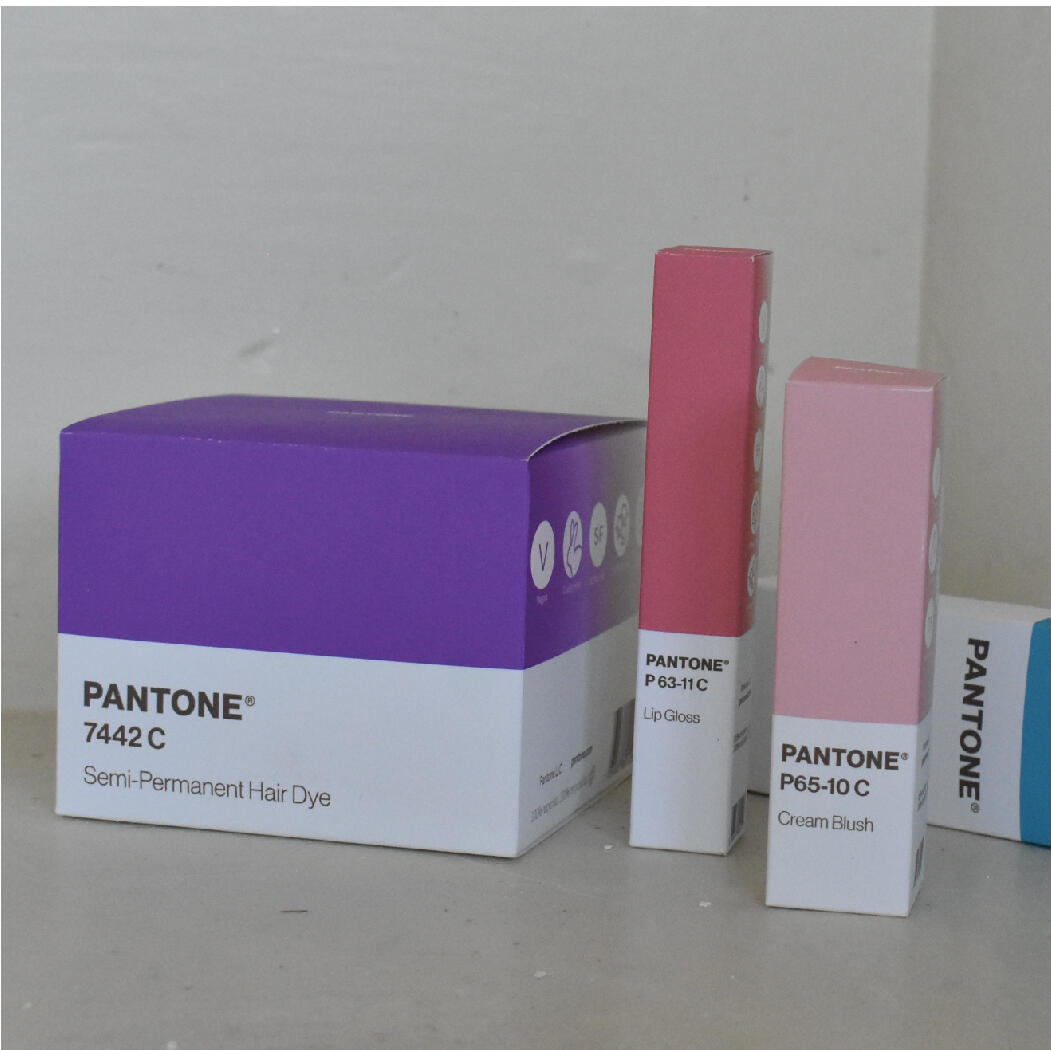
PANTONEThis product line extension for the color brand Pantone involved the design and creation of packaging for various cosmetics and hair products.My objective was to create beautiful, simple, eye-catching packaging for a Pantone line of beauty products in order to capture the brand’s essence of the importance of color, color trends, and color psychology. I chose cosmetics and hair products in hopes of infusing daily life with intentional color. These prodcuts include eyeshadow, blush, nail polish, lip gloss, and hair dye.This project is a celebration of Pantone’s modern design aesthetic and bold use of color. Through the application of Pantone’s core ideas to makeup and hair products, people are encouraged to express themselves through color. Pantone’s message is to help people and businesses use color in an effective way to portray a feeling, an identity, and specific values. When these values are applied to cosmetics, Pantone reinforces their brand values to a wider audience.

Untitled

Untitled

Untitled

Untitled

Untitled

Untitled


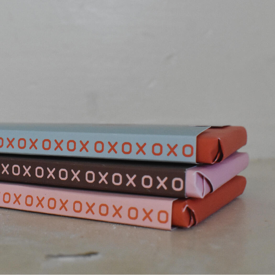
CHOCOLOVEThis is a re-design of the chocolate bar brand, Chocolove, where I designed a new logo, selected new colors and typefaces, and constructed the packaging for the chocolate bars.My goals for this re-design were to give Chocolove a more up-to-date logo while maintaining the brand’s vision of love, happiness, and quality. An updated typeface was needed to introduce a modern and luxurious feel while still portraying the values of the brand. I wanted to reuse the existing “xoxox” motif to continue the brand’s passion for love with a modern twist.Chocolove’s products are all about affordable luxury and emphasize the importance of ingredients—their cocoa beans are traceable to the farmer, and their ingredients are non-GMO verified. I wanted to make sure the new packaging highlighted these important qualities of the chocolate to reach audiences that value these sustainable practices.

Untitled

Untitled

Untitled


MITROFF CONSULTINGMitroff Consulting & Associates is one of the nation’s leading boutique executive search consulting firms with access to leading candidates from middle-management to the most senior executives across the country. Their clients span a wide range of industries, from the world’s largest companies to medium-sized businesses and entrepreneurial start-ups.Mitroff Consulting & Associates is committed to earning clients’ trust every day, on every assignment. Their clients have consistently benefited from expertise in executive search, personality assessment and a unique, collaborative search process led by experienced consultants with specialized knowledge in psychology.For this project, I was responsible for:
BRANDING & IDENTITY
Logo, Submark, Typefaces,
Color Palette, and UsagesWEBSITE
Created and Optimized for
Desktop and MobileDOCUMENT TEMPLATES
Candidate Release Form,
Draft Position Specification,
Exhibit A, Fee Invoice,
Letterhead, Recruiting
Services Agreement, and
Search Process.OTHER COLLATERAL
Business Card Design, Email
Newsletter Template, Email
Signatures, and LinkedIn Post Template

Untitled

Untitled

Untitled

Untitled

Untitled

Untitled


